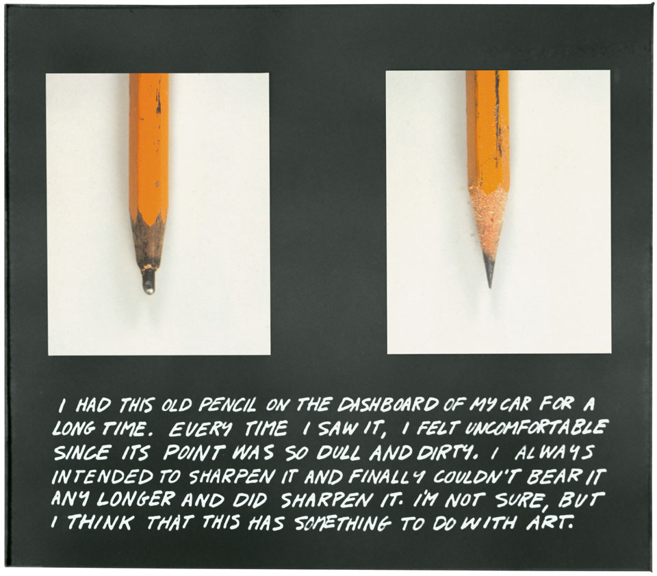
A Drawing by Richard Serra

Richard Serra Elevational Weights, Black Matter 2010 paintstick on handmade paper 82 × 68″

On your screen is….
a photograph…
….of a printed image in a book
…which itself is a photograph of the drawing.
The absence of any detail and referential elements leave us looking but not really seeing and actually, the more you look the less you see. You see, what you need to really see is just not there.
It’s the same with the endless reproductions on tea towels, biscuit tins and laptop sleeves of iconic works such as Van Gogh’s Sunflowers. We’ve looked at it of course, in all its guises. It’s instantly recognisable, but probably rarely really seen.
If you get to really see this work by Richard Serra you’ll notice that it’s large, at 82 x 68 inches, and in its own way as monumental as his sculptural works. Standing in front of it, it’s so much more than just a black rectangle and it plays with your perceptions every bit as much as his sculptures.
It’s a drawing on handmade paper so there is the texture of the paper showing in places. It’s made with paintsticks held together to produce a block for covering areas in a sweep. So there are distinct strokes and also a lot of variation in texture and depth. The paintsticks produce a surface which seems to play with the light, both absorbing it and reflecting it. It has a real feeling of depth and volume and earns its title.
I’ve never seen black as a negation of colour, or negative in some way. Because it contains all the colours its feels complete and one can spend time just being with it, understanding it and being excited by its possibilities. Its all there. It always was, maybe we just couldn’t see it.

Keron Beattie

A photo by Michael Wolf

From Tokyo Compression by Michael Wolf (2010)

I have chosen one image from a series of photographs by Michael Wolf.

The first thing that struck me when I first saw this image was the presence of intense pain, struggle and suffering of the subject staring out at us from behind the glass.

We view the portrait through a filter of water droplets which are on the inside of the space which the focus of the image occupies. We do not know the nature of this space but the presence of the moisture is suggestive of a humid, oppressive environment calling our attention to the discomfort of the subject. This then leads us to believe that she is being kept in harsh conditions, perhaps even against her will. The backdrop is dark, implying an unhappy, unsafe location and indeed, the subject looks troubled.

Michael Wolf began his career as a photojournalist and the reason I have revisited this image from his series Tokyo Compression, is because I have been reminded of it in recent years. There have been many ‘similar’ images in the media in the reporting of the desperate plight of the Syrian refugees, all of whom are trying simply to escape danger and keep themselves and their families safe.

The photograph that I have chosen here is not that of an individual from a war torn community or of a desperately frightened refugee fleeing danger, but an image from a series of portraits of city workers on their daily commute on the subway in Tokyo. The subjects of these photographs, which I find compelling, are certainly likely to be suffering; that is of course by today’s standards of those of us living a relatively mundane, but almost certainly a safe life. The anguish felt is that of the everyday grind of the chore of the monotonous repetitiveness of going to work to pay the bills.

I can’t help but observe how this image presents a somewhat over dramatic alternative to the actual reality, in the same way as what often currently happens on social media. Perhaps, though, this has more to do with the viewer and how we are conditioned by the copious amounts of shocking images we are flooded with in our news feeds and timelines today.

Sam Humphreys

A work by Félix González-Torres


Félix González-Torres “Untitled” (Perfect Lovers) 1991

A white painted wall. Mounted on it, two identical clocks positioned side by side. They are ordinary, ‘every-day’ clocks that could be purchased anywhere. There is nothing ‘pretty’ or special about them, they are just functional. The clocks keep exactly the same time and as we watch, we see time ticking away in front of us. Perhaps, we are watching our lives passing us by, our time here slowly running away and there is nothing that can be done to stop it.
But, there are two clocks and they are positioned closely together, so perhaps this coupling represents a real connection, signifying a relationship between them both. This can all be surmised by just looking at the piece but then we notice the title, “Untitled” (Perfect Lovers). The clocks then, represent two lovers.
Now, the ticking of the clocks feels like the beating of two hearts. Each clock is a very separate entity, but although they are two very separate beings they are completely in ‘sync’ with each other. They are connected so thoroughly that their hearts beat together as if they were just one being, they are in love. The two clocks are placed as closely together as possible whilst still remaining individual objects , but also, they are too close to allow anything to come between them.
The complete functionality and ordinariness of the clocks now begins to appear differently. Love between two people, whether it be a partner, a parent and child or between two friends is available to everybody. Love is special, a gift, but you don’t have to be out of the ordinary or ‘special’ to receive or experience love. Love creates bonds between people that can’t easily be broken. Of course, as we look at the two clocks we must face the knowledge that it is unlikely the clocks will both stop at the same time. One day, one of them will stop completely, leaving the other to go on ticking alone.
Félix González-Torres created this piece after the death of his partner from AIDS in 1991. He wanted to create work that both allowed him to share this very personal experience but keep it from being vilified because of his homosexuality.
He writes,
‘Two clocks side by side are much more threatening to the powers that be than an image of two guys sucking each others dicks, because they cannot use me as a rallying point in their battle to erase meaning.’
With this piece González-Torres shows us a beautiful tribute to the concept of love. He has removed all the unkindness and judgement of human nature, stripping away the pettiness of life, that we are all guilty of, and showing us instead the essence of love in its absolute purity.

Shelly Crowley

John Baldessari – The Pencil Story

John BaldessariThe Pencil Story (1972–3)
[Colour photographs, with coloured pencil, mounted on board]

The work comprises two photographs of what we are told is the same pencil, side by side, before and after being sharpened. Underneath the photos, hand written in white ink directly onto the black paper that they are mounted on, is a short text about Baldessari’s relationship with the pencil.

The work’s composition suggests a ‘scrap book’ style, the photos aren’t uniform, they don’t appear straight, the text is hand written and all in capital letters.

There’s something about the writing, though, that doesn’t feel as authentically scrap book as a first glance suggests. Although the style of the text seems like a quick note it differs from genuine rough note style in that the text is very neat. The lettering is clear, and the letter shapes are rather consistent. Each sentence is roughly the same length, suggesting that the time and planning were involved.

The text reads:

“I HAD THIS OLD PENCIL ON THE DASHBOARD OF MY CAR FOR A LONG TIME. EVERY TIME I SAW IT, I FELT UNCOMFORTABLE SINCE ITS POINT WAS SO DULL AND DIRTY. I ALWAYS INTENDED TO SHARPEN IT AND FINALLY I COULDN’T BEAR IT ANY LONGER AND DID SHARPEN IT. I’M NOT SURE, BUT I THINK THAT THIS HAS SOMETHING TO DO WITH ART.”
 

The text records the performance between the taking of the two images.

The pencils in the photos face lead-point down, and although the edges of the photos are not mounted straight, the pencils in each are straight in relation to the black mounting. The point of each pencil is exactly the same length from the bottom border and both in the same placement slightly closer to the left photo.

The photos illustrate the story. The pencil on the left is un-sharpened with a ‘dull and dirty’ point, the image on the right shows the newly sharpened pencil with a clean sharp lead.

There is a balance, careful placement of each component creating a visual that to the eye looks a little like a page from a sketch book but following careful and time tested rules of composition.  Baldessari gives the viewer all the visual clues to read this as a quick sketchbook-style page, creating a very authentic story, the story ending “I’M NOT SURE, BUT I THINK THIS HAS SOMETHING TO DO WITH ART” further suggesting to the viewer that this wasn’t intended as a finished work of art to be viewed in a gallery.

This piece literally questions itself and creates an interesting parallel to the ideas behind the ‘readymade’ and the authority of the ‘artist’ and the gallery.

Here is a piece I recreated as a post to social media site Instagram in response to this work.
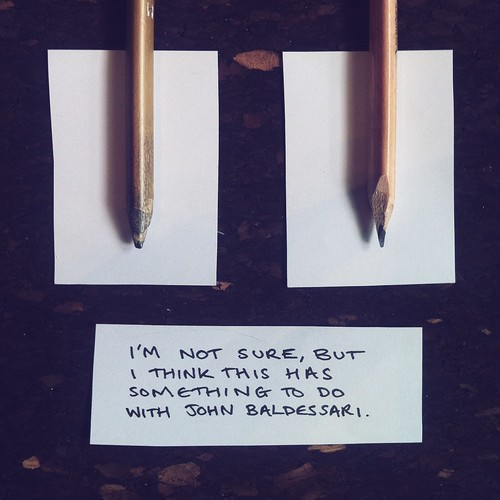
Liz Sterry